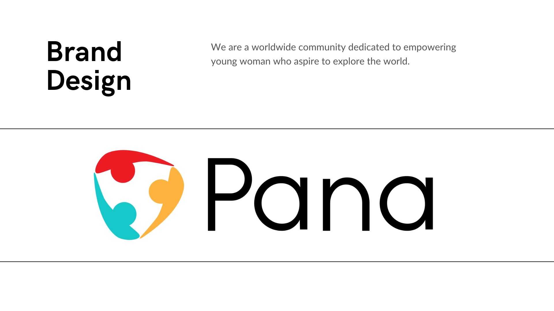
Pana: Your Safe Solo Adventure
Most travel platforms design for the destination. Pana starts with the person who's never left home alone before.

Project Collaboration
Pana was developed as a collaborative university project with my colleague Sina Maleki during the Strategic Branding course.
While I led the concept, user research, brand strategy, and experience design of the project, Sina focused on the business model, accountability structure, and strategic feasibility of the concept.
This collaboration allowed us to approach the project from both emotional and operational perspectives — combining human-centered design with sustainable business thinking.
Why This Problem Mattered to Me
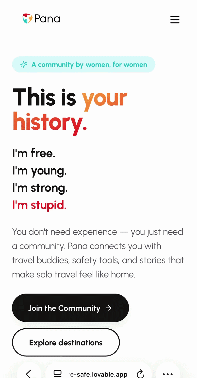
I've always been drawn to the moments just before something big happens. The decision to go. The fear that comes with it. When I started this project, I wasn't thinking about travel apps. I was thinking about a very specific person: a young woman standing at the edge of independence, wanting to see the world, but surrounded by voices telling her to be careful. That tension felt worth designing for.
The questions to started with
How do you empower someone to take a leap, while also making the people who love her feel safe enough to let her?
That dual tension — the traveler and the mother — became the foundation of everything.
How I approached it
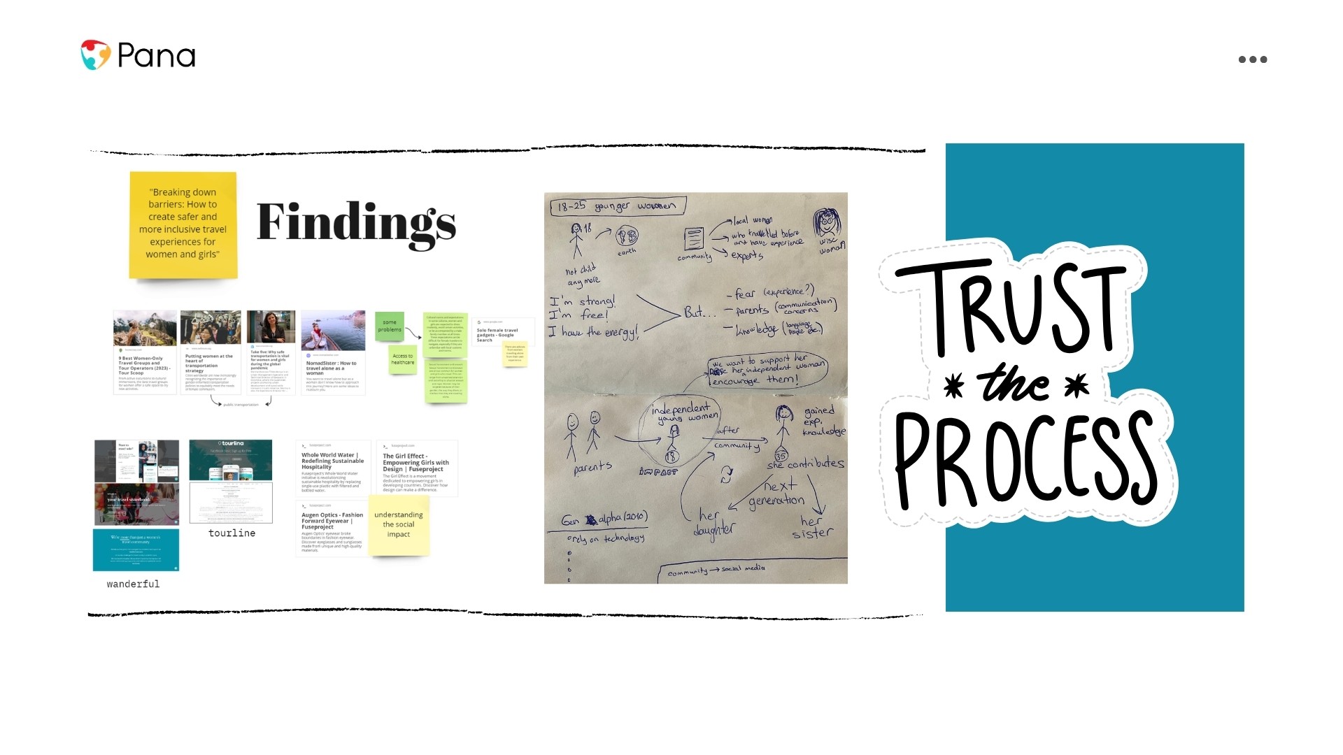
I treated this as a people problem before a design problem. Who is she? What does she actually need, not just practically, but emotionally? And who else is in the room when she makes this decision?
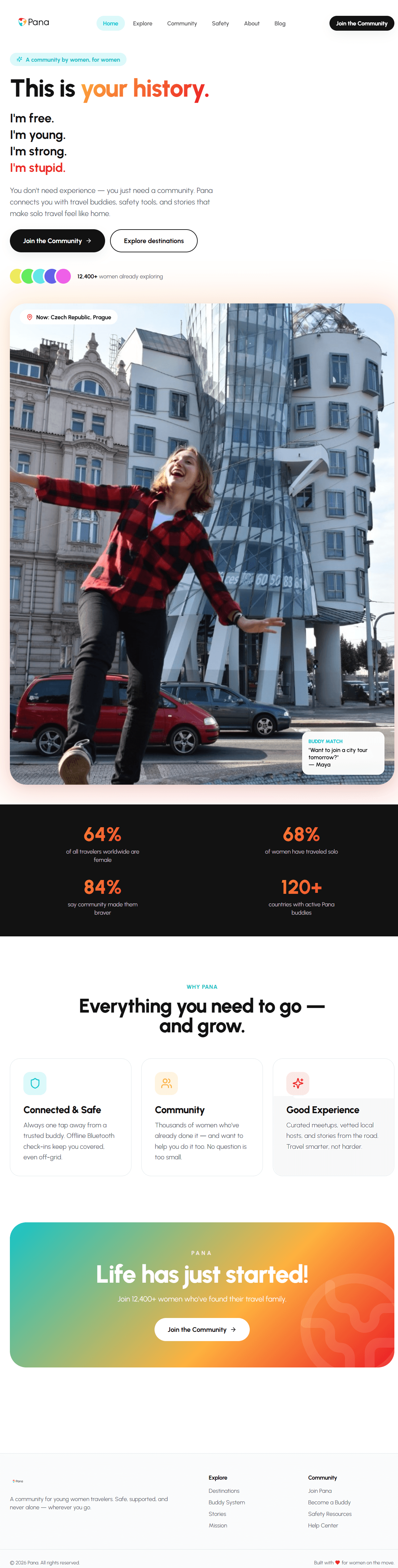
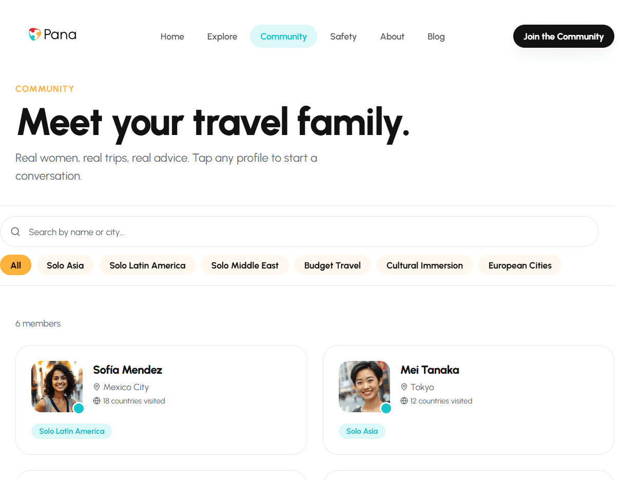
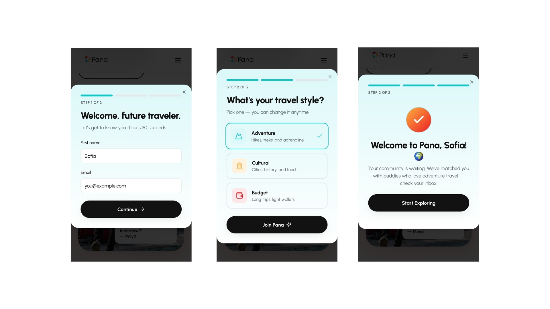
The research pointed to something most travel platforms ignore: young women traveling for the first time aren't just looking for destination guides. They need confidence, community, and a safety net that feels human — not clinical.
From there, the concept took shape around three pillars: staying connected and safe, belonging to a community of experienced women travelers, and discovering the world through people you can actually trust.
My Design Approach
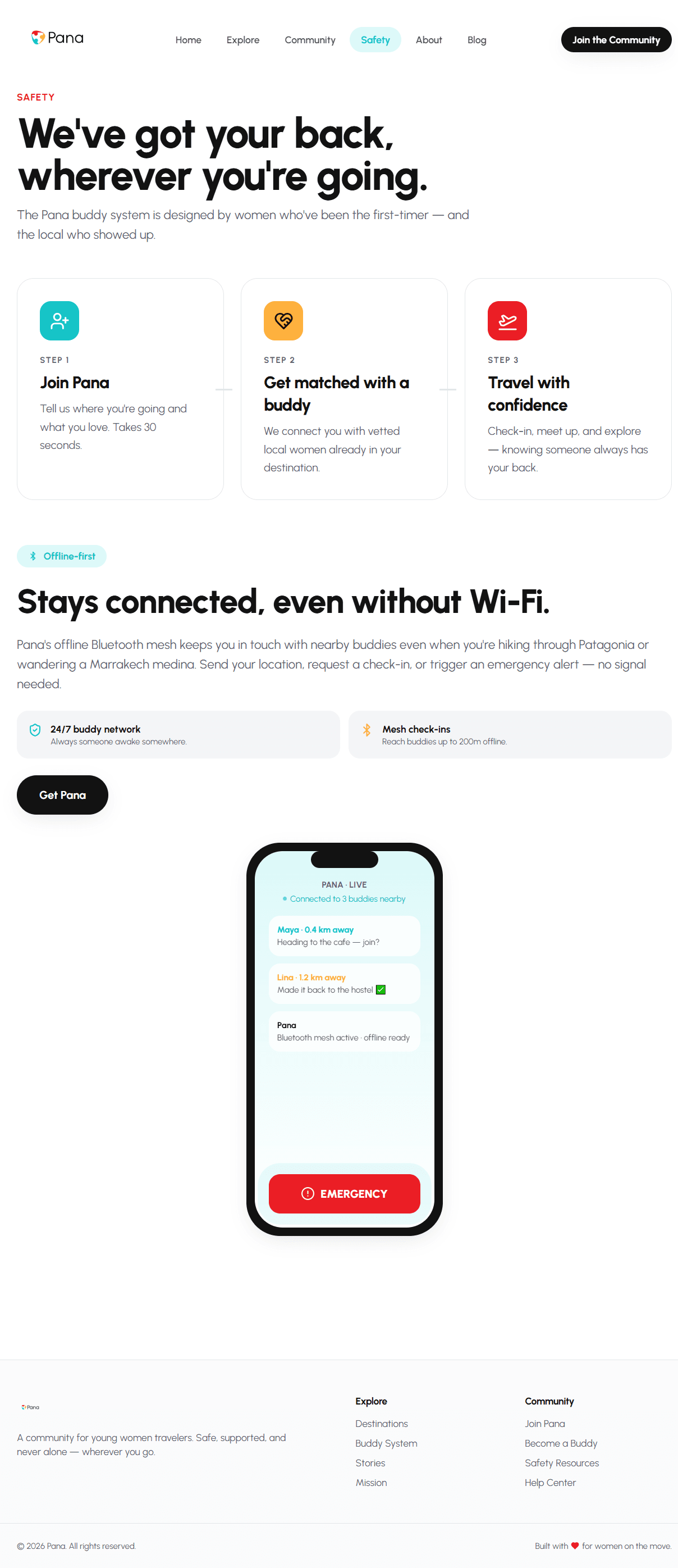
The service concept centers on a buddy system, pairing first-time travelers with experienced women from the local community. Not a chatbot. Not a rating system. A real human connection, designed into the service from the beginning.
One detail I'm particularly proud of: the buddy connection works offline via Bluetooth. Because the moments you most need support are often the moments you have no signal.
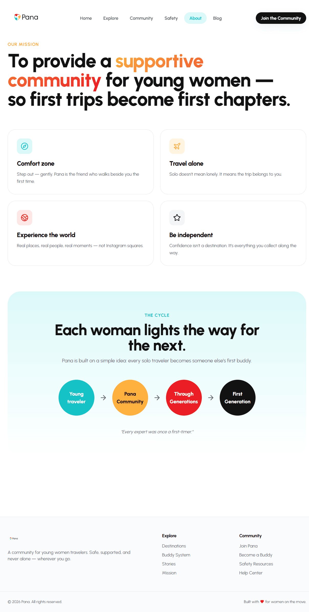
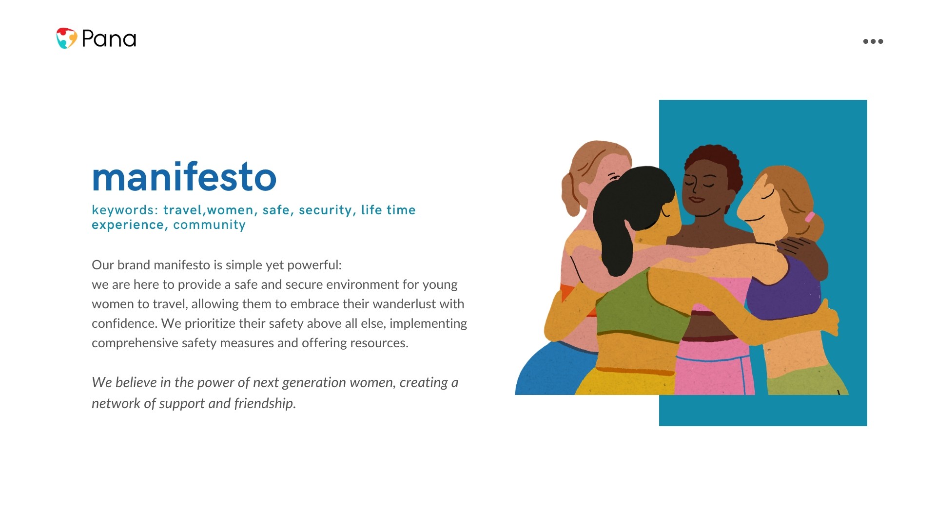
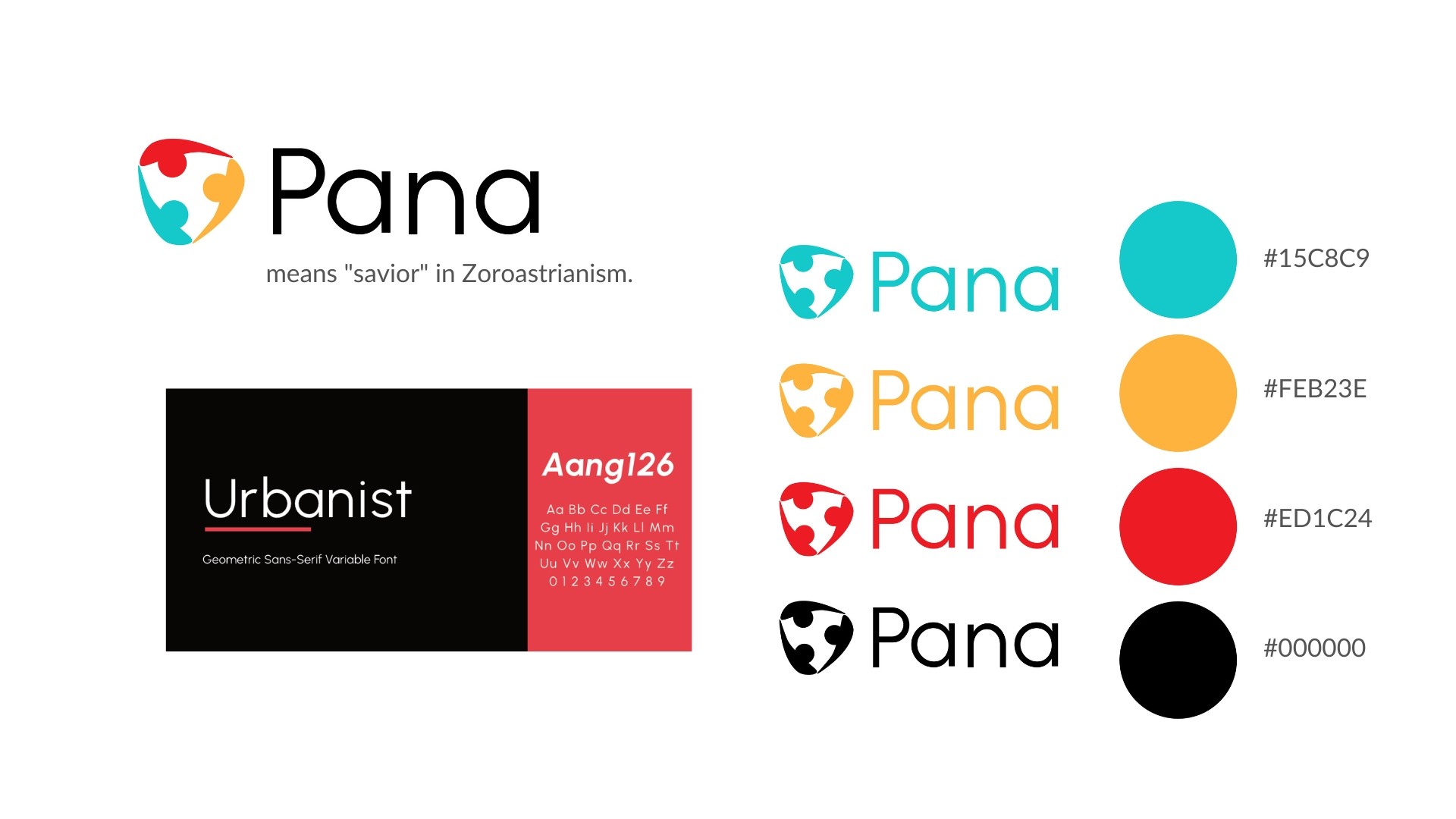
The brand; name, logo, colors, typography was designed to hold all of this. Pana means "savior" in Zoroastrianism. The logo is three people, forming a shield. Nothing was arbitrary.
What I believe
Safety and independence are not opposites. The right service design can hold both at the same time. That's what Pana tries to do — not remove the fear of traveling alone, but give young women the community and confidence to go anyway.
What this project gave me
It taught me that brand is not decoration. When it's done well, it's the clearest expression of what a service believes in. Every color, every word, every interaction touchpoint is a chance to say:
" we see you, and we've got your back."